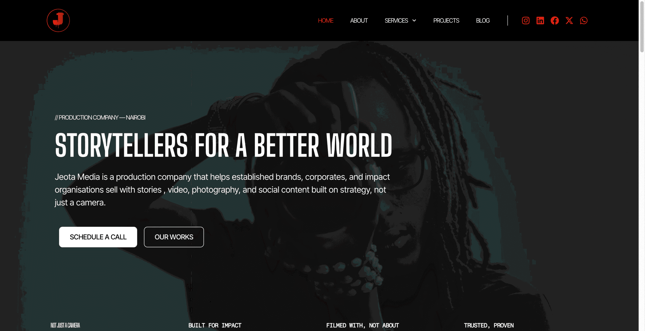
Jeota Media had outgrown its website.
The company’s production work, ambition and brand direction were stronger than the digital experience representing them. The site needed to do more than look better. It needed to communicate the business clearly, present the work properly and give Jeota a stronger foundation for search.
So we rebuilt it from the structure up.
Overview
Jeota Media is a production company with a strong body of work and a clear creative direction.
The problem was that the website was not doing justice to either.
The previous site had unclear information architecture, duplicated content, inconsistent UI decisions and weak SEO foundations. Services were difficult to understand, the work was not presented as strongly as it could have been, and the overall experience did not reflect the quality of the brand.
Our job was to rebuild the site into something clearer, more considered and more useful to the business.
The challenge
The website was underselling the brand
Jeota already had the work and the credibility. What it did not have was a website that reflected that.
The previous build made it harder than it should have been for a potential client to understand what Jeota does, how its services fit together, and why they should choose the company.
There were also structural issues.
Content was duplicated in places. The information architecture was unclear. UI decisions were inconsistent. Key services did not have enough space to stand on their own, and basic SEO foundations had been missed.
For a business built around storytelling, production and visual craft, the website itself did not feel considered enough.
That was the bigger problem.
The site was not simply outdated. It was weakening the perception of the brand.
The strategy
Start with structure, not decoration
We did not approach the project as a visual reskin.
Before touching the interface, we worked through what the website actually needed to do.
- What should Jeota be known for?
- Which services deserve their own pages?
- How should a prospective client move through the site?
- How should projects be discovered?
- What does someone need to understand before they are ready to make an enquiry?
Answering those questions gave us the structure first.
From there, we could make better decisions around content hierarchy, page layouts, navigation and search.
Rebuilding the information architecture
The first priority was making the site easier to understand.
We reorganised the website around Jeota’s actual services and how a potential client would naturally evaluate a production company.
Instead of treating the site as a collection of pages, we treated it as a journey.
A visitor should be able to understand:
- what Jeota does
- the kind of work it produces
- the services available
- the quality of previous projects
- how to take the next step
That sounds simple, but it was the part that made everything else work better.
Giving the work more space
Jeota’s strongest asset is the work itself. The website therefore needed to stop competing with it.
We simplified the visual system and created clearer hierarchy across the site so imagery, video and project work could carry more of the experience.
The goal was not to make the website feel overly designed. It was to make the design feel intentional enough that the work could speak for itself.
Building search into the foundation
SEO was not treated as something to add after the website was finished. The structure of the site, service pages, content hierarchy and page relationships were considered from the beginning.
That gave Jeota a stronger foundation for search while still keeping the website focused on people first. The aim was never to turn the site into an SEO template.
It was to make sure the website could be understood by both potential clients and search engines.
The result
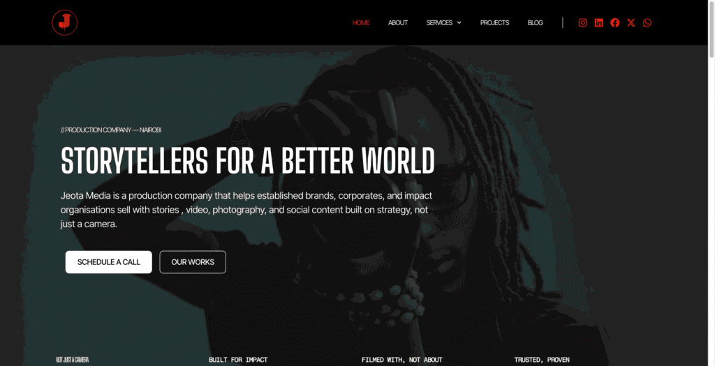
The new website gives Jeota a much clearer digital presence. Its services are easier to understand, the work is presented with more confidence, and the overall experience now feels much closer to the level of the company behind it.
More importantly, the site is now built on a structure that can grow with the business. New services, projects and content can be added without recreating the same structural problems that existed before.
And from a search perspective, Jeota now has a much stronger base to build from.
What changed
Before
- unclear website structure
- duplicated content
- inconsistent UI
- services that were difficult to navigate
- weak SEO foundations
- a digital experience that did not reflect the quality of the brand
After
- clearer information architecture
- stronger service hierarchy
- more intentional project discovery
- cleaner visual presentation
- stronger search foundations
- a website that better represents Jeota’s work
The bigger lesson
A website redesign should not begin with how the homepage looks. It should begin with what the business needs the website to do.
For Jeota, fixing the structure first made the design better, the content clearer and the search foundation stronger.
The final result is not just a nicer website. It is a website that finally feels aligned with the business it represents.